There are many creative logos in the NCDA, almost too many to list here. But here is a list of what I consider to be the greatest logos in the league, past and present.
![]() The first of many DePaul products on this list, the DePaul “Dodgeguy” logo is a classic logo for the team. Featuring the flag of the city of Chicago, along with a ball, a cool font, and the dodgeguy himself, DePaul’s main logo is a great start for this list.
The first of many DePaul products on this list, the DePaul “Dodgeguy” logo is a classic logo for the team. Featuring the flag of the city of Chicago, along with a ball, a cool font, and the dodgeguy himself, DePaul’s main logo is a great start for this list.
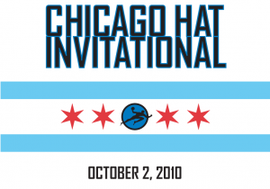 Another DePaul product, the Chicago Hat Invitational logo is a hidden gem in the logo business. A simple logo using the flag with the dodgeguy, it’s very clean looking.
![]()
This new logo for Kent State is an adaptation of the Kent State Athletics logo that looks phenomenal. My favorite touch is the PG 8.5 on the ball, making it extremely true to the sport.
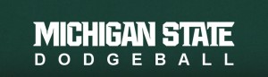 How could I do a list of my favorite logos without my favorite one of my own team? This take on the new font for MSU gives a tough look for the Spartans.
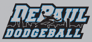
The dodgeguy going over the skyline of Chicago? Pretty awesome.
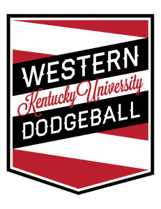
The WKU “soccer crest” as I like to call it, is a very classy logo and very unique for the league.
![]()
The MAD alternate logo is great. It uses the Nationals 2010 logo and makes it look like a school logo, not a team logo. Good touch.
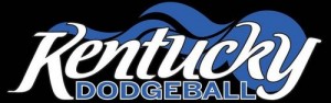
Finally, my favorite dodgeball logo. The simplicity of the logo, along with how well everything fits together, is just flat out amazing. Great job UK!
What are your favorite logos that I didn’t mention?
The DePaul main is a collab between Kevin Hill and I, likely one of my favorite logo’s I’ve ever worked on. Using the dodgeguy was a great honor, since it was originally produced by Ryan ‘Magoo’ McGeehan, a mythical leader for DePaul Dodgeball when I first started playing. The CHI 2010 logo was one of mine, real simple and moderately quick but I love how it turned out. Surprised to see it on the list! Our club shirt design for 2012, the Chicago skyline idea was Becky Seemann [DePaul #9], i just made it into a vector to print. We had an additional ladies’ shirt design that is similar, but with the skyline/dodgeguy placed on top of DePaul.
I’ve always had an appreciation for teams that are allowed to use their school’s well known athletic logo (JMU, MSU, BG). at DePaul we aren’t allowed but that can encourage some cool features, like using the chicago six pointed star, flag, and skyline. And of course dodgeguy, we’re lucky we have it.
Definitely something I like is Towson’s: http://ncdadodgeball.com/images/tu_logo.png
They use their athletic logo which I loved before they joined the League. But they nicely and cleanly incorporate “dodgeball” on the top right.
Maybe its just staring at it for 3+ years, but I also really enjoy our League logo. The square alternate is an honorable mention. One thing i’d like to do is redraw it into a 25-15 format, maybe standardize the trailing slashes. But it could just as well stay as is.
The WKU, UK, NCDA (both) and Nationals 2011 (both) logos are all the work of Bowling Green designer Derek Sabiston. He’s designed a dozen or so logos for me. Teams that are looking for a fresh new look, hit up Derek on Facebook. He’s super affordable and always does incredible work, as evidenced by this list.