The thing that can separate teams from looking cool/ professional or looking basic/ unassuming. Here President/ Captain of WMU Dodgeball and Kent player Mitchell Porter give their favorite jerseys a shoutout.
Honorable Mention: University of Virginia
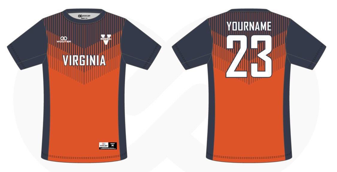
The only reason UVA’s jerseys didn’t make the list is that they actually don’t comply fully with the NCDA rules on jerseys. They are super cool as I am personally a big fan of vibrant colors/ things that stand out. While UVA’s Arrow Fade design shows promise, it falls somewhat short of execution with its clunky lines that gradually fade, proving to be an eyesore for those who appreciate jersey aesthetics, such as the both of us.
6. University of Maryland
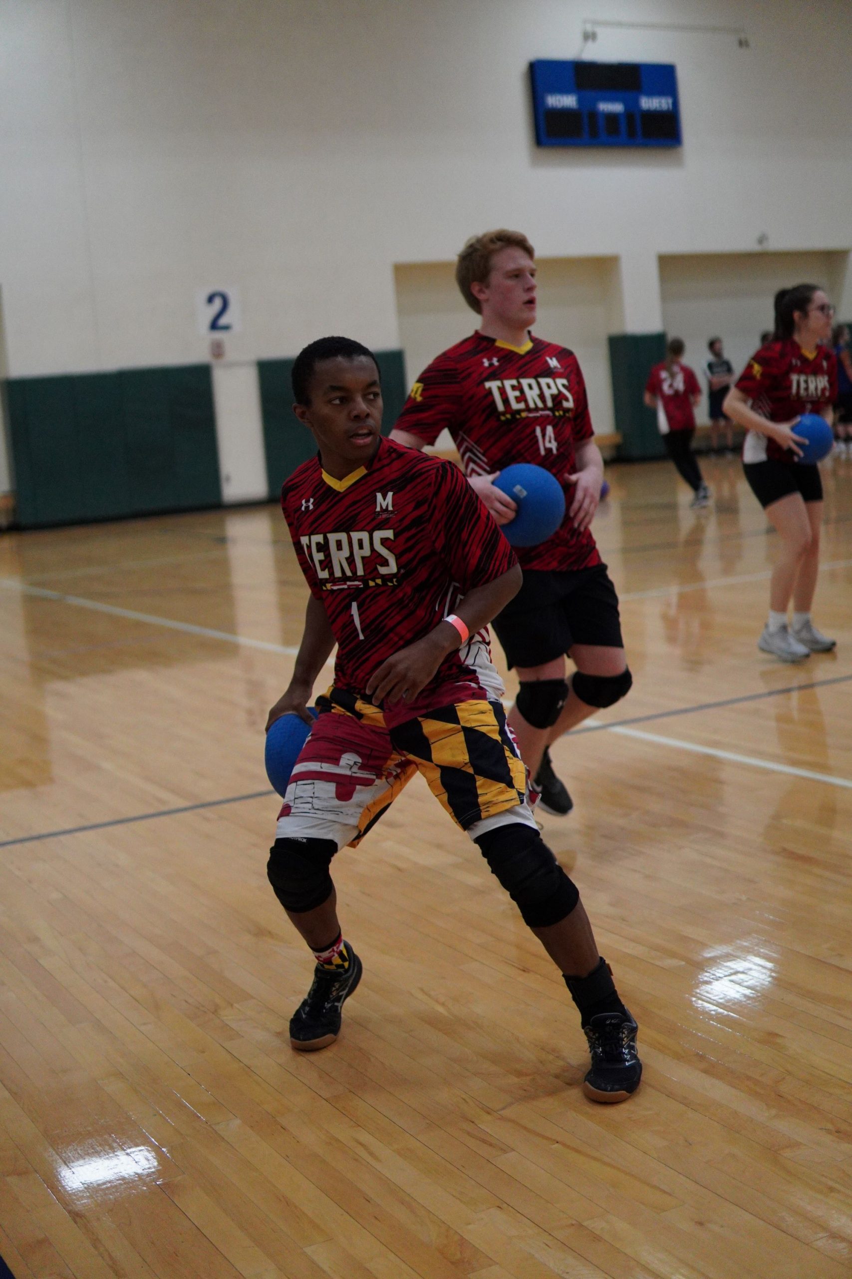
Very underrated jerseys when thinking of the coolest jerseys in the league is UMD’s. The terps did a great job following all the NCDA rules for jerseys while also making a cool jersey. The Maryland Terrapins possess a jersey that is perhaps the most “busy” of all, featuring a combination of horizontal red and black stripes, as well as shorts that pay homage to the Maryland state flag. My favorite part about their jerseys is that some players choose to get shorts of the flag, which pair well with the jersey.
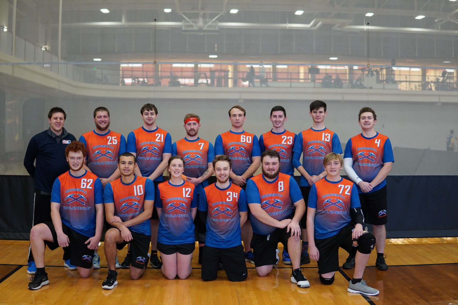
5. University of Wisconsin-Platteville
As previously noted, the combination of Blue & Orange is a classic pairing that rivals even that of Peanut Butter & Jelly. Wisconsin-Platteville’s gradient fade jersey provides a noteworthy example of how to highlight this color combination. However, if I were in charge of UWP’s jersey design, I would make two adjustments.
- Firstly, while the Gradient Fade is nearly executed flawlessly, the middle portion appears somewhat “mushy” as it attempts to blend two vastly distinct colors. Despite their best efforts, the outcome falls slightly short of my preferences.
- Secondly, the numbers on the jerseys are too large, an aspect that holds greater importance in jersey rankings than many might expect. While it is understandable that players want their numbers to be visible, the design appears disproportionate due to the size of the numbers.
Overall, UWP boasts a sleek and stylish design that more teams should strive to emulate (as we see @ #1). The jersey successfully captures the essence of the team and is well-constructed to serve its purpose during gameplay.
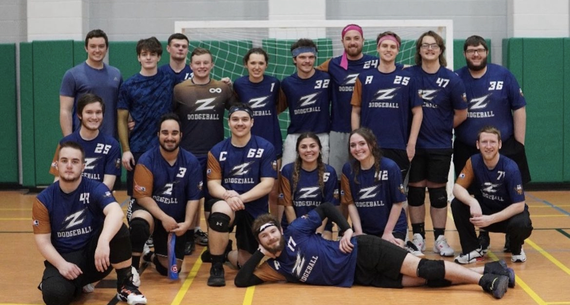
4. Akron University
Occupying the highly-regarded fourth spot on this list are the University of Akron Zips. With a distinct style that deviates from that of any other team in the National Collegiate Dodgeball Association (NCDA), the Zips incorporate their alternate logo, “Zippy”, onto their jersey sleeves. Additionally, the classic phrase “Fear ROO” is emblazoned on the jersey, accompanied by the menacing gaze of a kangaroo, serving as a warning to their opponents. The Zips’ jersey design is reflective of their team ethos, exemplifying a sense of cleanliness and classiness. Furthermore, the harmonious contrast between the blue and gold hues utilized in the design adds to its aesthetic appeal. However, I am hesitant to rank them higher on this list, as I believe that there is room for improvement in their design.
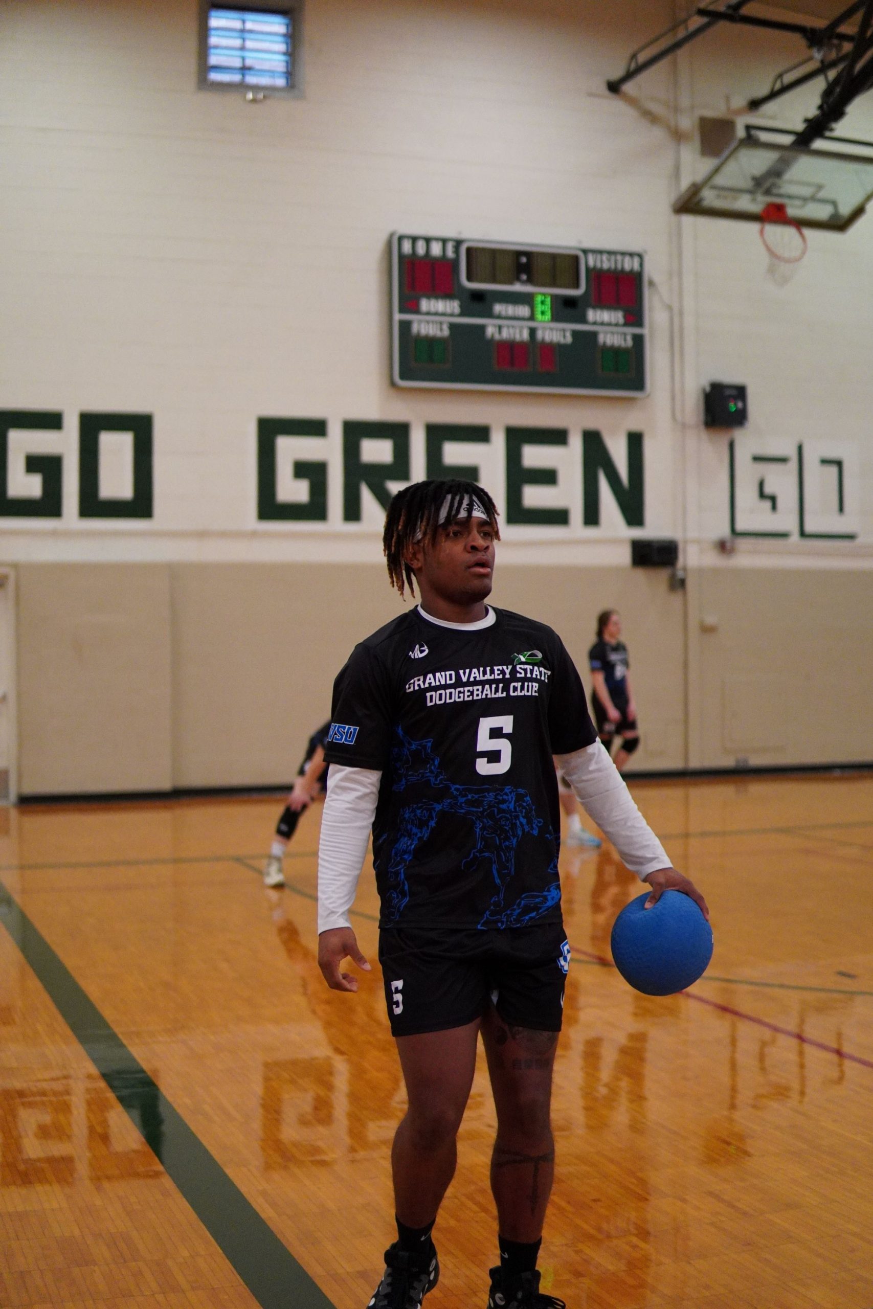
3. Grand Valley State University
The Lakers, a team held in high regard throughout the College Dodgeball community, are by far the most successful team in the history of the league. Unlike the Stanford Cardinal, who hold the distinction of being the most successful team in college sports, the Lakers can make a strong case that their jerseys are as impressive as their team’s performance on the court. Grand Valley State University incorporates a blue pattern on their jerseys to pay homage to their fireball throws, which produce a “smoky” effect, highlighting one of the team’s many strengths. This addition to the jersey design is a striking visual element that stands out flawlessly against the black background. Overall, GVSU does an admirable job with their jersey design, but it still falls short of the top two spots on the rankings by the both of us.
2. Western Michigan University
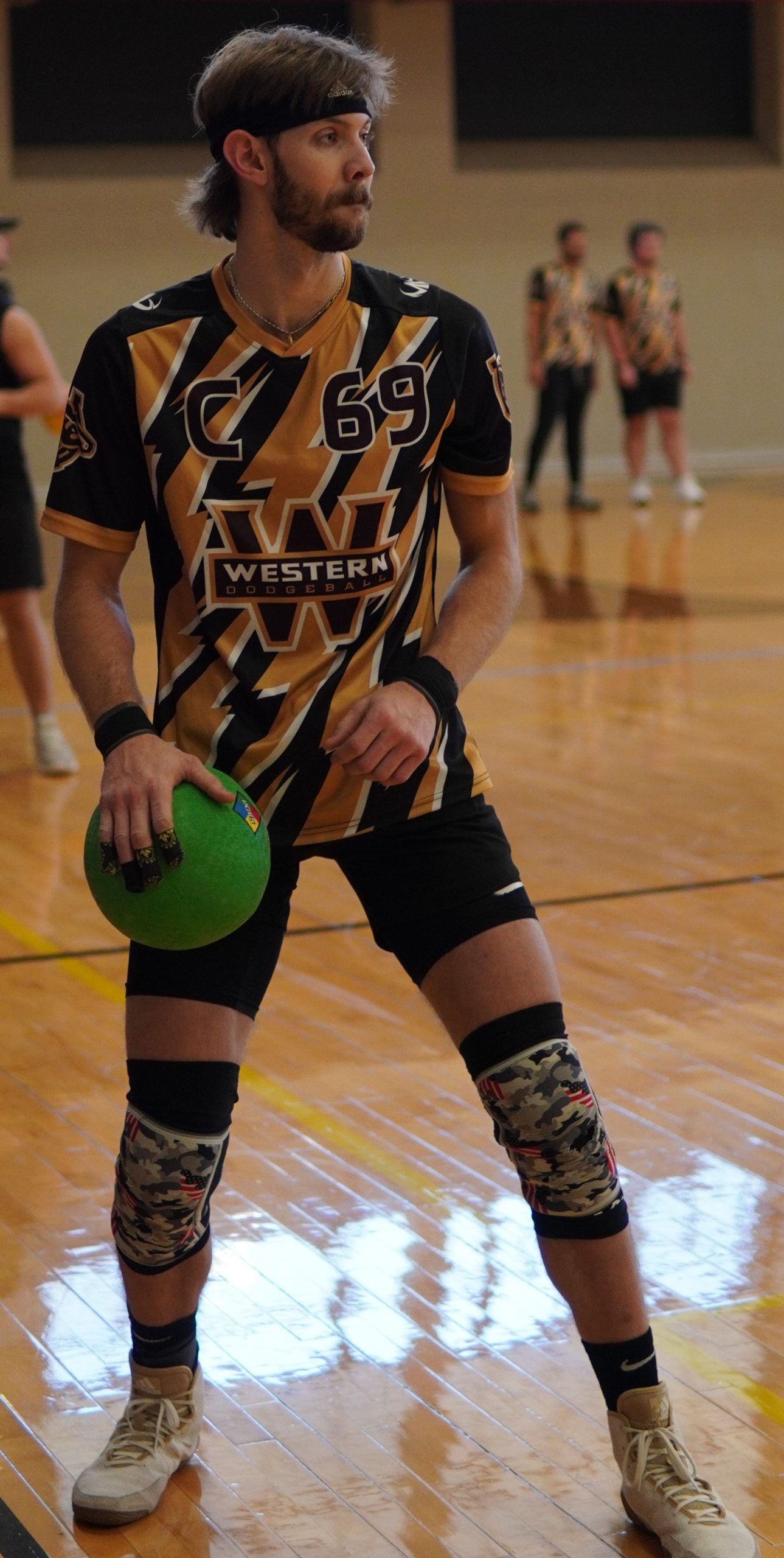
The brown and yellow combination is not seen very often, but when life gives you brown and yellow lemons, you make an amazing jersey – that’s the saying, right? Western Michigan stands out from almost everyone in the NCDA as they utilize a tiger-like pattern with horizontal lines that create a breathtaking visual. The Broncos knew what to do off the court when designing these jerseys, and also on the court, as their new jerseys have bred new talent into this team, which has rocketed up the power rankings thanks to an aggressive style of play that leaves opponents in disarray. Overall, the Broncos have made the ultimate concoction out of a horrible color palette and have done a very good job not only of showing their creative expertise but also their improvisation skills, which are essential both on and off the court.
1. Kent State University
After careful consideration and analysis, the top spot in our jersey rankings goes to none other than the Flashes. This team has hit the jersey jackpot with their thunderbolt design, which has captured the imagination and attention of many teams around the league. The design is a reference to their mascot, “Flash the Eagle.” Kent State has been able to improve on their past designs by finally stepping out of the box when it comes to jersey designs. In their early years, they tried to use a “baseball template” for jerseys, but they moved away from those ideas in 2014-2015, and their jerseys have been improving year on year, culminating in the incredible heights they have reached this year.
From the thunderbolts and gradient fade on the sides to the perfectly sized number and name on the front and back, it is evident that Kent State has won the title of “Best Jersey in the NCDA.” The team has found the perfect balance between being busy and stale and not only are the jerseys impressive, but the team is just as “flashy,” as their jerseys alude to with a perfect combination of jersey design and team mentality, making it an easy choice for the #1 spot on Matt and I’s list.
Concluding Thoughts:
Jerseys are the one thing that can have teams stand out in your mind or have them be grouped together with the rest of the league. Being a supporter of the vibrant colors and interesting designs, I hope more teams can follow the example of these jerseys and make the league look better.
您分享的内容很精彩,如果您需要好看有平价的球衣,欢迎光临我的网站:cheap sport jersrys
This was a very good post. Check out my web page 48U for additional views concerning about Airport Transfer.
I came across your site wanting to learn more and you did not disappoint. Keep up the terrific work, and just so you know, I have bookmarked your page to stay in the loop of your future posts. Here is mine at 81N about Airport Transfer. Have a wonderful day!